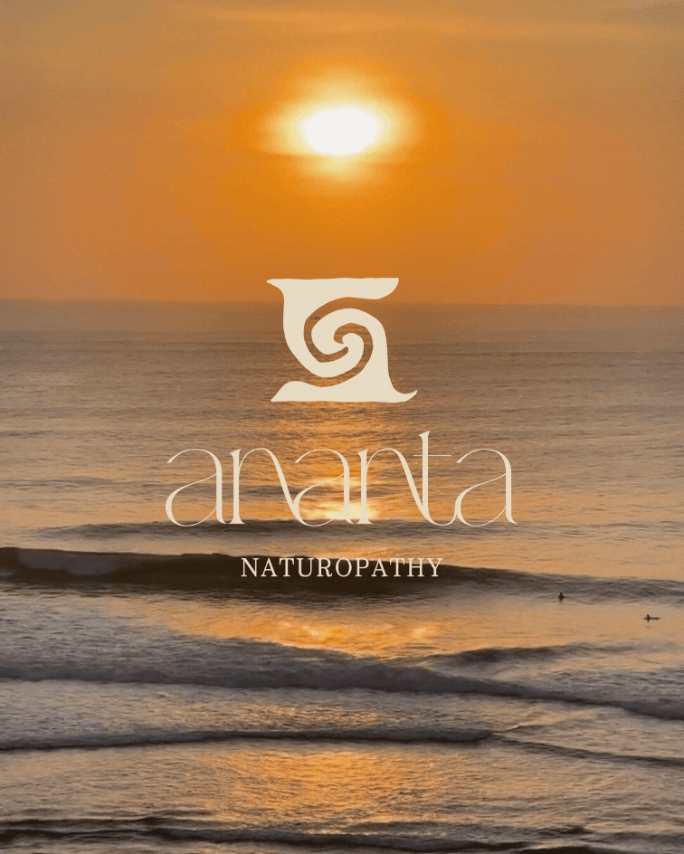
Ananta Naturopathy
PROJECT: BRAND IDENTITY
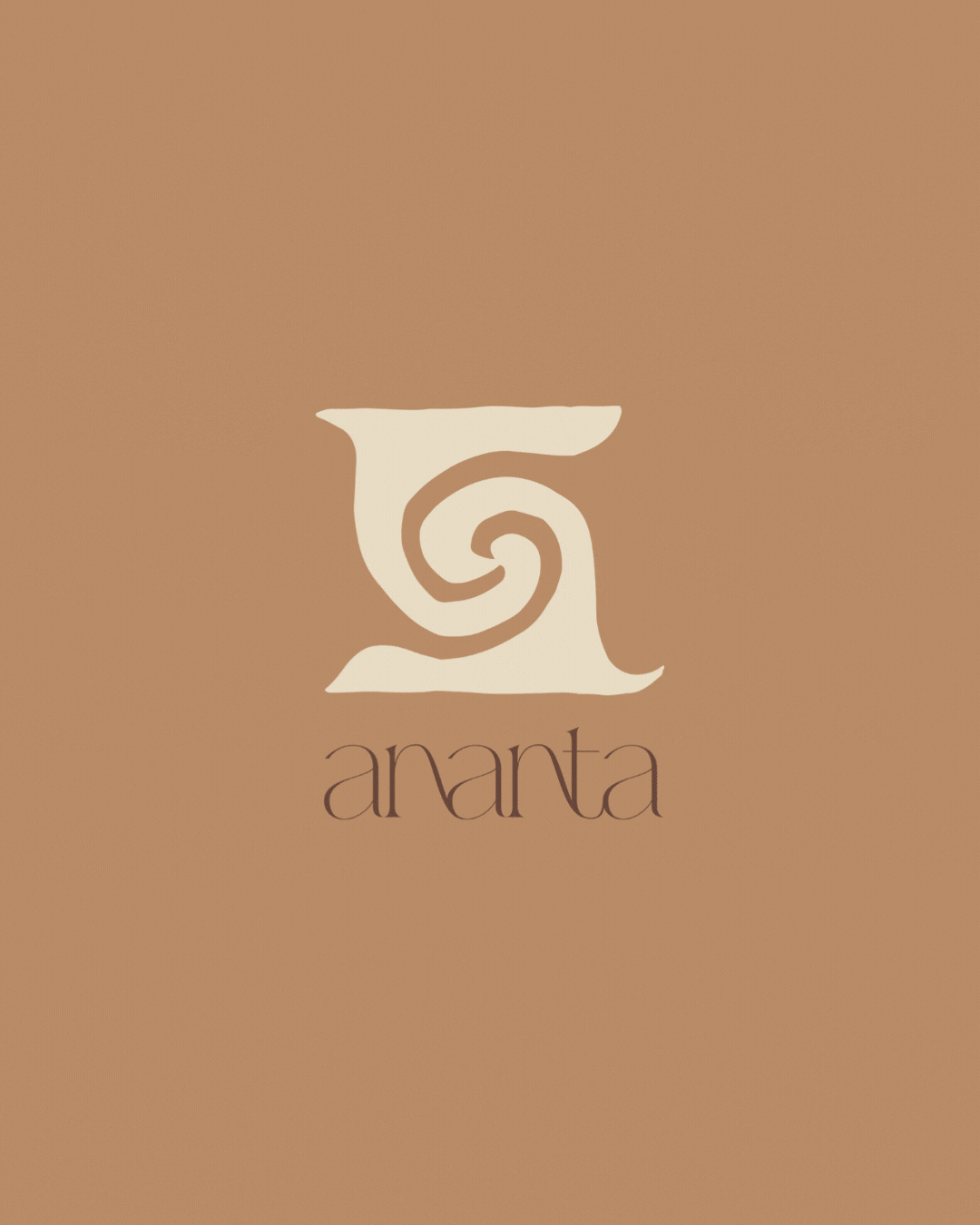
Full logo suite and brandmark symbol
Colour palette
Typography System
Social Media Assets
Branding designed for Ananta Naturopathy, a supportive wellness space of warmth and nourishment.
We created a brandmark symbol that fuses together waves and spirals, two symbols that resonate with the client and her brand ethos. This symbol is an embodiment of both the client and the brand, acting as a recognisable, unique element that gives a brand both soul and strategy.
The waves represent the healing, nourishment and openness that the ocean offers us. The spiral, often found in nature, symbolises evolution, growth and introspection, reflecting the parallels between humans and nature. We used an earthy colour palette and a whimsical primary font that flows from one letter to the next, to embody nature and its flow.